


Hello! I'm Sydney.
Your hype girl, sounding board, designer, and friend! I design branding and websites for business owners who want to pave the way in their industry.
There’s a specific feeling that brings most of my clients to me.
It’s not a dramatic moment. It’s more of a slow, uncomfortable awareness. They’re sending their website link and adding “I know, I know, it needs work” before anyone even clicks it. They’re getting inquiries that don’t match their pricing. They’re doing incredible work — work they’re genuinely proud of — and their brand just isn’t keeping up with it.
If that sounds familiar, this post is for you.
Outgrowing your brand is one of the most common and most overlooked problems in small business. It doesn’t announce itself. It just quietly costs you — in missed opportunities, misaligned clients, and the mental energy you spend apologizing for your online presence instead of feeling confident about it.
Here’s how to know if it’s happening to you.
There’s a specific feeling. You’ve probably had it.
You’re about to send your website link to a potential client and you pause — just for a second — before hitting send. Not because anything is technically wrong. Just because something feels off. Like you’re sending them to a version of your business you’ve already moved past.
That feeling is data. And it’s worth paying attention to.
I had a client come to me recently who had been building her business for three and a half years. She’s a color analysis and personal styling expert in Fort Worth — talented, established, with a loyal client base and a very clear sense of who she is and what she does. She said something in her inquiry that stopped me in my tracks:
“I have incrementally invested in my website over the past 3.5 years but it’s lacking. I design my own business cards, gift certificates, etc. I really need some cohesiveness.”
And then she said this:
“I really like how clean your designs are. That really speaks to me vs a busy loud design — which is what most think I’m looking for since I’m in color analysis. I want sophisticated with drops of color here and there.”
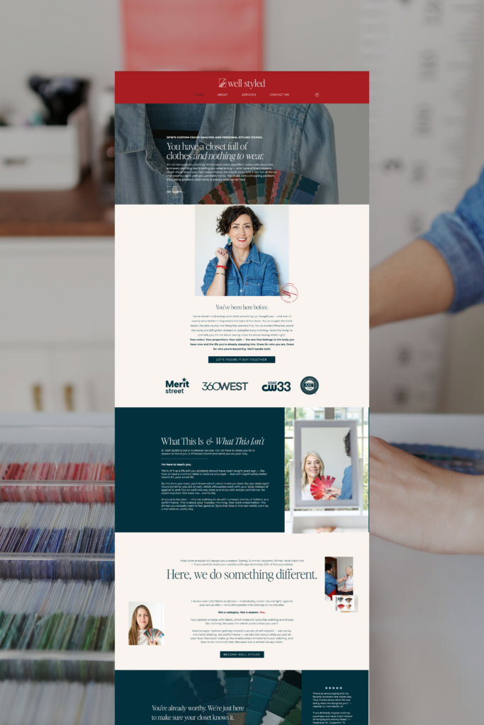
Before: all the fonts. Any font, but similar blues. Very close! Very graphic heavy!
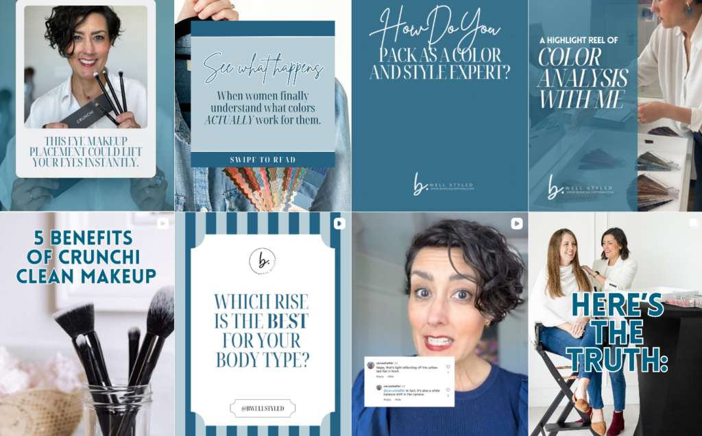
After: Cohesive color palette, elevated and consistent font suite. Modern, luxury website.
She had outgrown her brand. She knew it. She could even articulate exactly what she wanted instead. She just hadn’t had anyone help her get there yet.
That’s the thing about outgrowing your brand — it rarely announces itself loudly. It sneaks up on you. One incremental investment at a time, one DIY business card at a time, until you look up one day and realize everything you’ve built looks like it was designed by five different people across five different years. Because it was.
Here’s how to know if you’re there.
You’ve been investing incrementally instead of intentionally
This is the most common one and the hardest to see when you’re in it. A new headshot here. A Canva template there. A website refresh that updated the photos but kept the old structure. A business card you designed yourself because you needed it fast.
None of those things are wrong. But over time, incremental investment without a cohesive strategy creates a brand that looks like a patchwork quilt — each piece individually fine, nothing working together as a whole.
If different parts of your business look like they belong to different businesses, you haven’t outgrown your brand — you’ve never actually had one. A brand isn’t a collection of assets. It’s a system. Everything — your logo, your colors, your fonts, your website, your business cards, your social graphics, your email signature — should look like it came from the same place. Because it should.
When a client tells me they design their own business cards and gift certificates because they just need something, that’s the sign. Not that they’re bad at design. That they don’t have a brand system that makes it easy to stay consistent.
Your brand gives the wrong impression before you say a word
Here’s the one that stings a little. And I say it with complete respect, because it’s fixable.
If your brand doesn’t visually match your level of expertise, your pricing, or your actual aesthetic — it’s working against you before you’ve even said hello.
My client in color analysis knew this instinctively. She knew that most people in her industry default to busy, colorful, loud design — and that it wasn’t her. She wanted something sophisticated. Elevated. Restrained. Not because that’s a trend, but because that’s actually who she is and what she offers.
But if her brand was communicating something else — something busier, louder, more generic — then her dream clients, the ones who want sophisticated and refined, might be scrolling right past her. And her current clients might be showing up with different expectations than what she actually delivers.
Your brand either attracts or repels before anyone reads a word. It sets the price expectation, the sophistication level, the vibe of what working with you will feel like. If you’re getting price shoppers, difficult clients, or just the wrong kind of inquiries — start with your brand. It’s almost always saying something you didn’t intend.
You feel embarrassed or apologetic about your online presence
The pause before sending the link. The “I know it needs work” pre-apology in an email. The way you hesitate to share your website in a networking group or on a podcast.
That feeling is your gut telling you something your brain hasn’t caught up to yet: your brand has fallen behind where you actually are.
This is especially common for business owners who’ve been growing steadily for a few years. You’ve gotten better at what you do. Your clients have gotten more aligned. Your prices have gone up. But your brand still looks like it did when you were just figuring things out — because you’ve been too busy actually running the business to stop and fix the thing that represents it.
The problem is, while you’ve been growing, your brand has been frozen in time. And potential clients don’t know who you are now. They only see who you were when you designed that logo.
Everything you’ve built looks like it was made by different people
Because it was.
This is the cohesion problem, and it’s one of the most underestimated things that holds established businesses back. When your Instagram looks different from your website, which looks different from your business cards, which looks different from your email newsletters — your potential client’s brain has to work harder to trust you.
Trust is built through consistency. When everything looks like it came from the same intentional place, your brand builds credibility automatically. When it doesn’t, there’s a subtle friction that people feel but can’t always name. They just know something feels a little off. And a little off is enough to make them keep scrolling.
Cohesion isn’t about everything being matchy-matchy. It’s about everything feeling like it belongs to the same story.
You know what you want but you can’t get there by yourself
This is the most important one, and my client said it perfectly.
She knew she wanted sophisticated. She knew she didn’t want busy and loud. She could articulate her vision clearly. She just hadn’t been able to execute it herself — because executing a cohesive brand identity that translates across every touchpoint isn’t a DIY job. It’s a strategy job.
There’s a version of this that a lot of business owners get stuck in: they have great taste, they know what they want, and they spend hours in Canva trying to get there. The result is always something that’s almost right but never quite. Because the gap isn’t creativity — it’s system, strategy, and the expertise to translate a vision into something that actually works everywhere.
When you know what you want and you can’t get yourself there, that’s not a failure. That’s the signal that you’re ready to hand it off.
So what do you do about it?
First — take the honest inventory. Look at every single place your brand shows up. Your website, your social media, your business cards, your email signature, your proposals, your invoices. Do they all look like they belong to the same business? Do they communicate the level you’re actually operating at? Would a stranger who landed on each one know they were looking at the same company?
Second — ask yourself the hard question: if your dream client found your website today, would they stay or would they scroll? Would they see themselves in what you’ve built? Would they feel the level of sophistication, care, and expertise that you actually bring?
And third — if the answer is no, or even “I’m not sure,” stop patching. Stop making incremental investments in a system that doesn’t have a strong foundation. A new headshot on an unclear website is still an unclear website.
The fix isn’t another Canva template. It’s starting from a place of actual strategy — getting clear on your positioning, building a visual identity that reflects it, and making sure everything from your logo to your website copy is saying the same thing in the same voice with the same level of sophistication.
That’s what a rebrand actually is. Not starting over. Catching up.
That’s exactly what The Brand, Copy & Website Sprint is built for.
In three weeks, you get a fully repositioned brand identity, website copy written in your voice, and a custom Showit or Wix website built to convert — all under one roof, all working as one system. No juggling freelancers. No dragging timelines. Just a brand and website that finally catches up to the business you’ve actually built.
If you’ve been reading this post nodding your head, it’s time. You don’t have to keep apologizing for your website. You don’t have to keep sending that link with a disclaimer. You’ve built something real — your brand should prove it.


